Robertson Network Data Visualisations
The visualisations are based on a small dataset that shows the path of postal surveys among a network of people, connected to William Robertson (1721–1793). The data is the result of research by Dr. Ida Federica Pugliese, at the Moore Institute in NUI Galway.
The objective was to create a set of visualisations suitable for use by Ida during a conference presentation: “Questionnaires and Scholarly Networks in the Enlightenment”, given at the The Republic Of Letters Goes Digital Conference, NUI Galway, Ireland, 20 March, 2015.
Creating the visualisations
The visualisations were created using a process that relies on a number of tools:
- Excel was used to explore the dataset provided and to clean any obvious errors (such as additional commas or blank lines). The data was then exported as two .csv files, one containing the nodes, and one containing the edges.
- These .csv files were then imported into Gephi, which was used to create the network graphs. Some further details on this is provided below.
- Once each graph stage was complete, it was exported as a .svg file. This was then edited in Adobe Illustrator, which was used to improve the design. Again, more on this is given below. Each file was exported as a .png file, with a size suitable for use in a PowerPoint slide.
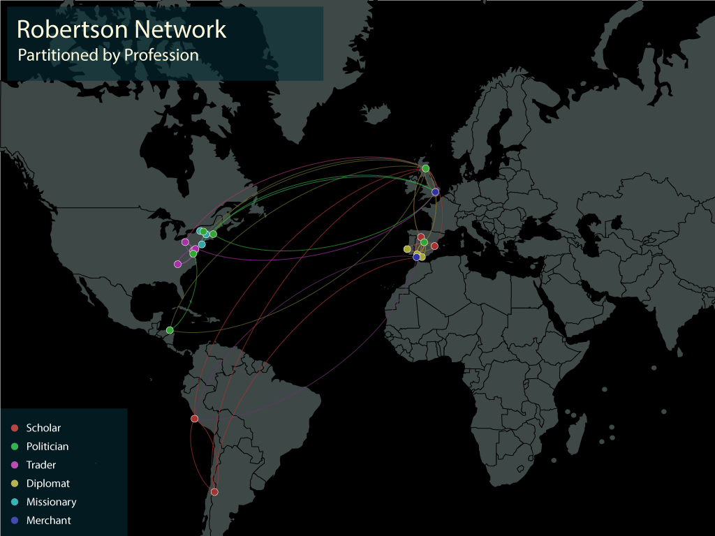
- Finally, the Nodes spreadsheet was exported from Gephi, and imported into Tableau. This was then used to create the Location/Profession heat-map image. Again, this was manually tweaked using Illustrator, after printing it to a PDF file in Tableau (Tableau does not give any way of exporting a vector file directly).
Preparing the data
The data was provided as a single Excel file, with two sheets, one for the Nodes, and one for the edges. To prepare it for use in Gephi, there was some minor formatting needed:
- In the Edges sheet, re-name the “Number of Connections” column to “Weight” – this is a keyword recognised by Gephi, which avoids the need to change the data once it’s inside Gephi. Similarly, the edges sheet should have columns called Source and Target, that contain Identifier numbers that correspond to the entries in the Nodes sheet – this will allow it to be imported without issue into Gephi.
- Clean the data: in this case, that meant removing an extra comma, and some blank lines. During this step, you should look out for any inconsistencies, errors or omissions that might cause problems for the tools being used on the data.
- Enhance the data. For the heat-map visualisation, the Geographic locations are divided based on their wider Network location (Europe, North America, South America) – doing that required an extra column be added to the spreadsheet.
Once the data preparation was complete, each sheet was saved as a .csv file.
Creating the Network Graph
Create a new graph in Gephi, and import the two .csv files inside the Data Laboratory tab.
Because some of the visualisations we were interested in uses geo-data, it was important to set the datatype for the Latitude and Longitude columns as Double. This will avoid problems (which I encountered the first time I did this) later when creating geographic layouts with the network data.
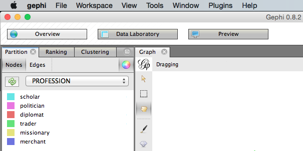
Partitioning
To create the diagrams showing the network colour-coded by Profession or Location, use the Partition > Nodes tab. Select the dimension you want to use from the dropdown list (click the circular refresh button first if necessary).
Geographic Layout
This data dealt with people in set physical locations, initially given by a city location, but updated to include a latitude and longitude. There were two steps used to display the network on a map:
- Install the GeoLayout plugin for Gephi, and follow the instructions for its use (ensuring you have the correct datatype set for the lat/lon values)
- Export the
.svgfile and import it into Illustrator, where it is manually placed on a map layer. There were some design tweaks done, before the whole image was exported for use.
Note: Another option is to use the MapOfCountries plugin to display the background map within Gephi.
Cleaning up the Design
I found that Gephi gives you only so much control over the design of its output. For this reason, each .svg file was opened in Adobe Illustrator, and a variety of changes were made.
In general, the types of updates to each graph included:
- Setting up a layout the size of a PowerPoint slide, and re-sizing of the graph to fit the required area for display;
- Adding a new background;
- Formatting labels with new fonts, sizes and manual re-positioning – Gephi places the labels on the nodes, which can sometimes make reading them difficult. Doing this manually would be problematic in a larger graph.
- Adding legends, headings, etc where required
- Re-colouring, or changing the thickness of the edges, or arrows
- Re-colouring the nodes, or the node borders, to make them easier to see / differentiate.