Dáil Transcript Data Visualisation – Graphing Speakers & Named Entities
I recently published a visualisation of content from a selection of Dáil (Irish Parliament) transcripts – it is available at gov.davidkelly.ie.
Data used for the project was published on GitHub by KildareStreet.com. It covers transcripts between the 17th January, 2014 and the 17th July, 2014.
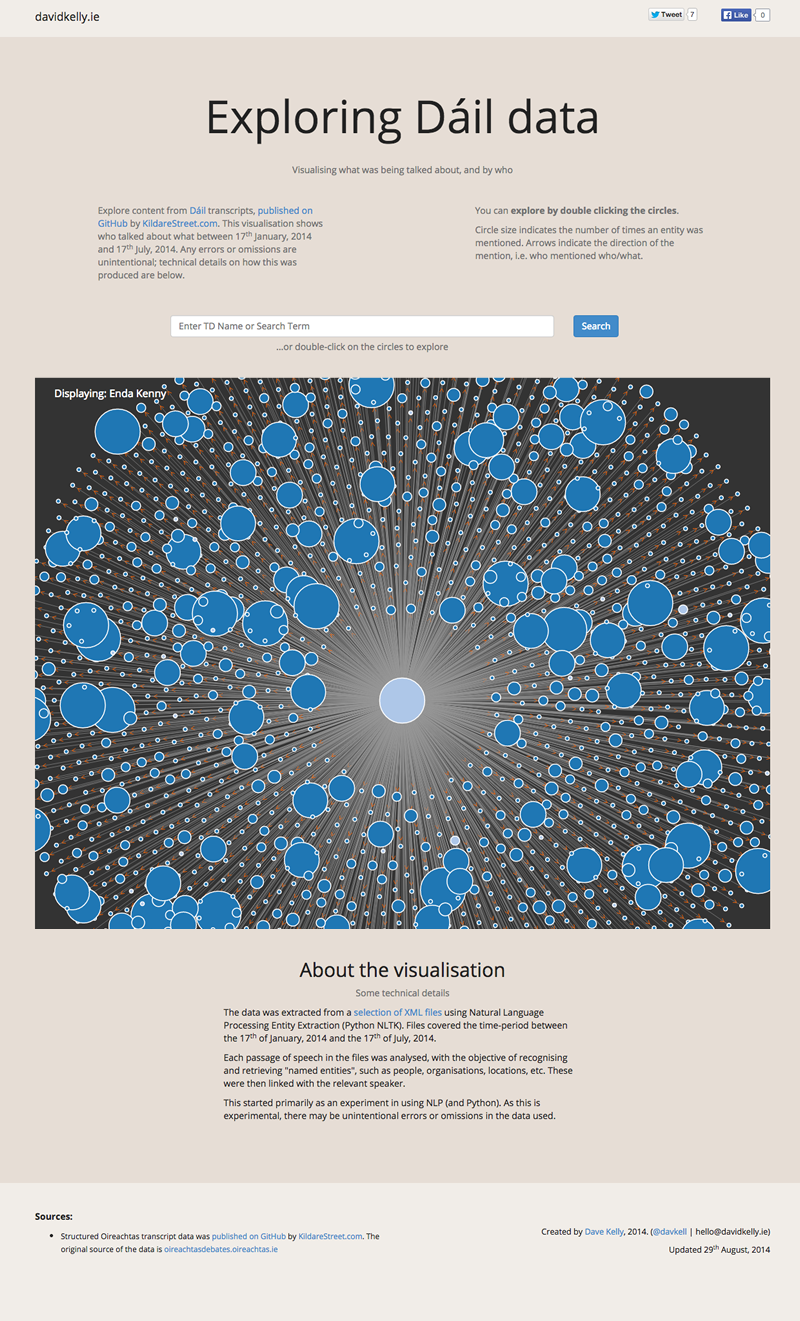
Data is displayed as a graph, that shows what speakers talked about what people, organisations, or locations (“named entities”). The visualisation allows you to navigate using the “bubbles” or nodes – doing this will show you who else has spoken about a topic, or other topics a speaker has mentioned. You also have an option to search for a person, or other entity, which will show you any networks related to them.
About the data
The initial dataset used was 78 XML files (~38.8MB). The files covered the time-period between the 17th of January, 2014 and the 17th of July, 2014. The data was originally published by KildareStreet.com.
Once processed, the graph has a little over 11,500 nodes – the speakers, and other named entities described above – and approximately 45,500 edges – the connections between the nodes.
The development
The data was extracted from a selection of XML files using Natural Language Processing Entity Extraction (Python NLTK).
Each passage of speech in the files was analysed, with the objective of recognising and retrieving “named entities”, such as people, organisations, locations, etc. These were then linked with the relevant speaker.
D3.js is used to create the visualisation. Navigating or searching the visualisation causes the graph to be re-drawn using data pulled from the application’s API. The back-end is a Laravel-based PHP application.
Limitations
The visualisation doesn’t display all topics discussed by the speakers in the Dáil – it captures only instances where a speaker refers to an “entity”. The project is also not a search facility that searches the full text of the transcripts, although there is code available for a search tool in the Github repository holding the source data.
The size of some of the graphs being displayed, and the type of interaction required, mean that it’s not the most user-friendly of experiences on smaller mobile- and touch-screen devices. Hovering over nodes will display names, something which isn’t as smooth when not using a mouse pointer to interact with the interface. Sorry about that.
This started primarily as an experiment in using Python and Natural Language Processing. As this is experimental, it is possible that there may be unintentional errors or omissions in the processed data.